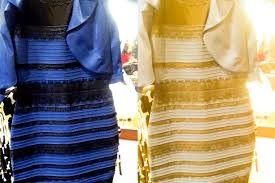
 By now most of us have had a chance to weigh in on the internet phenomena of “the dress”. You know, the blue and black one (or is it white and gold?). The diverse results of this “test” really calls into question how we see colour and what does lighting have to do with it.
We did “the dress test” in our office – same screen, same time of day – 50% split on results. The blue dress camp completely dumbfounded by how anyone could see white and gold and vice versa. This seems to be a typical result. The scientific explanation for these massive perception variations seems to be that the mind is continually evaluating what we see, its surroundings and context and making adjustments accordingly based on experience. In the instance of the circulated dress photo there is very little context in which to evaluate leaving each viewer’s mind to fill in the unknowns. This ambiguity results in a variety of mental compensations typically involving possible lighting conditions surrounding the dress. Being faced with the knowledge of these inconsistencies in perceived colour, it drives home the point that human factors must be taken into consideration when assessing colour influenced by a light source.
The current methods of assessing colour accuracy of a light source – CRI or Colour Rendering Index as it is known in the lighting industry – is a significantly defective metric given the evolution of new “man-made” light sources. The basis of the Colour Rendering Index (CRI), originated in 1931, is a qualitative percentage of a light source in comparison to the incandescent lamp on 8 pastel colours. This rating system was important in the development of phosphor-based light sources such as fluorescent or high intensity discharge. It served as a comparative measure against the familiar incandescent bulb when newly designed sources were typically sitting between 25 and 65 on the CRI scale. The problem with incandescent serving as the benchmark for colour accuracy is that incandescent is not a full spectrum source; it is essentially a fire in bottle, so not surprisingly lacking in the “cooler” blue end of the visible spectrum. It has continued to be a benchmark of sorts due to the fact that people are comfortable with it – the comfort provided by the fire in a bottle is anthropological, deeply ingrained from our caveman roots. The CRI test is facilitated in a sphere, unaffected by external influences. The industry has understood the shortfalls of this metric for some time and there are on-going studies revolving around new methods of light source evaluation in relation to colour. What CRI failed to take into consideration was the largest of external factors – people’s individual assessments and preferences.
So, what colour is it really? Given the conversations and debates on individual colour perception based on the dress, and the faulty 80+ year old rating system – what colour is it? How do we know that the colour that I learned in primary school to be red does not appear as I would describe as green to you? What colour is that scarf? Is that sofa black or blue? What colour is the grain in the wood panelling? How do we know?
The continuing development of LED technology has opened up the possibility of tuning-in “optimal” colour quality. We just have to agree on what that is. At least agreeing that CRI (or CRI alone) isn’t an optimal metric is a good progressive step.
Recent studies have us heading in the right direction. While still respecting the “science” of previous colour accuracy tests, a new scale falls much closer to the range of human preference. This new scale is called the Gamut Area Index (GAI). Groups of individuals evaluated colour and light combinations based on the GAI and found a consensus of preferred light quality and colour. We have to take a leap of faith that those of us with normal vision all see the same colour when we look at an orange but this new measure offers us a better quality of light which appears to balance the perceptual variations of the individuals – even those of you that saw a white and gold dress.
These findings are being used to create LED sources that meet our visual colour preferences – more than any previous source. As we are all aware, a CRI rating of 80+ is considered good – the higher the better. This is similar for the GAI measure: A GAI rating of 80 or higher indicates a source’s colour rendition capability. While few manufacturers to date have embraced the Gamut Area Index, we can take comfort in the fact that we are finally heading in the right direction just by having the discussion that alternative metrics can have value. LED technology offers us the opportunity to create and subsequently specify sources optimal to our needs with colours far superior to any previous sources, with the exception of the sun. A metric that more accurately represents human perception variations and colour preferences will be a useful design resource.
Making a difference with lighting is about understanding how people react to lighting, what they prefer, and what draws their attention. Specific colors can spark specific emotions, even move people to take action — nudging them to relax, shop longer or engage with an environment more than they initially planned. It is now possible, more than ever, to use lighting as a valuable design tool to create visually appealing and influential spaces.